Blog2026-02-20
Five Design Trends to Watch in 2026
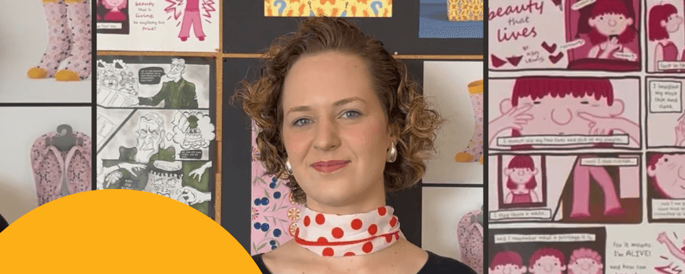
Red & Yellow’s BA Honours in Visual Communication Design lecturer Jordyn Dreyer gives you her five design trends you never saw coming.
If you ask Jordyn Dreyer, Red & Yellow’s new BA Honours in Visual Communication Design lecturer, where she’s from, she’ll tell you that she grew up in an orange house with a big peppercorn tree. It comes as no surprise that Jordyn defines her life by shades and hues, tints and tones.
With a master’s degree from Stellenbosch University, via a stint exploring IoT product design and figure painting in Pforzheim, Germany, plus a stretch at the University of North Carolina Greensboro, R&Y’S newest lecturer takes chromaphilia to a whole new level. In fact, if colour blindness had an opposite, it would have her name.
“Art is a social action,” she says, adopting the provocation-heavy ethos of contemporary artist, activist, and filmmaker Ai Weiwei, as her own.
“I’m drawn to the bold colours, shapes, and silhouettes,” she goes on, resplendent in a shade one might call glowing ember. “I love how the Memphis Design approach to everyday objects makes you rethink what a teapot or a bookshelf could be.”
We asked Jordyn to look ahead. Here’s what she sees shaping design in 2026.
1. Transforming the banal through whimsy and storytelling
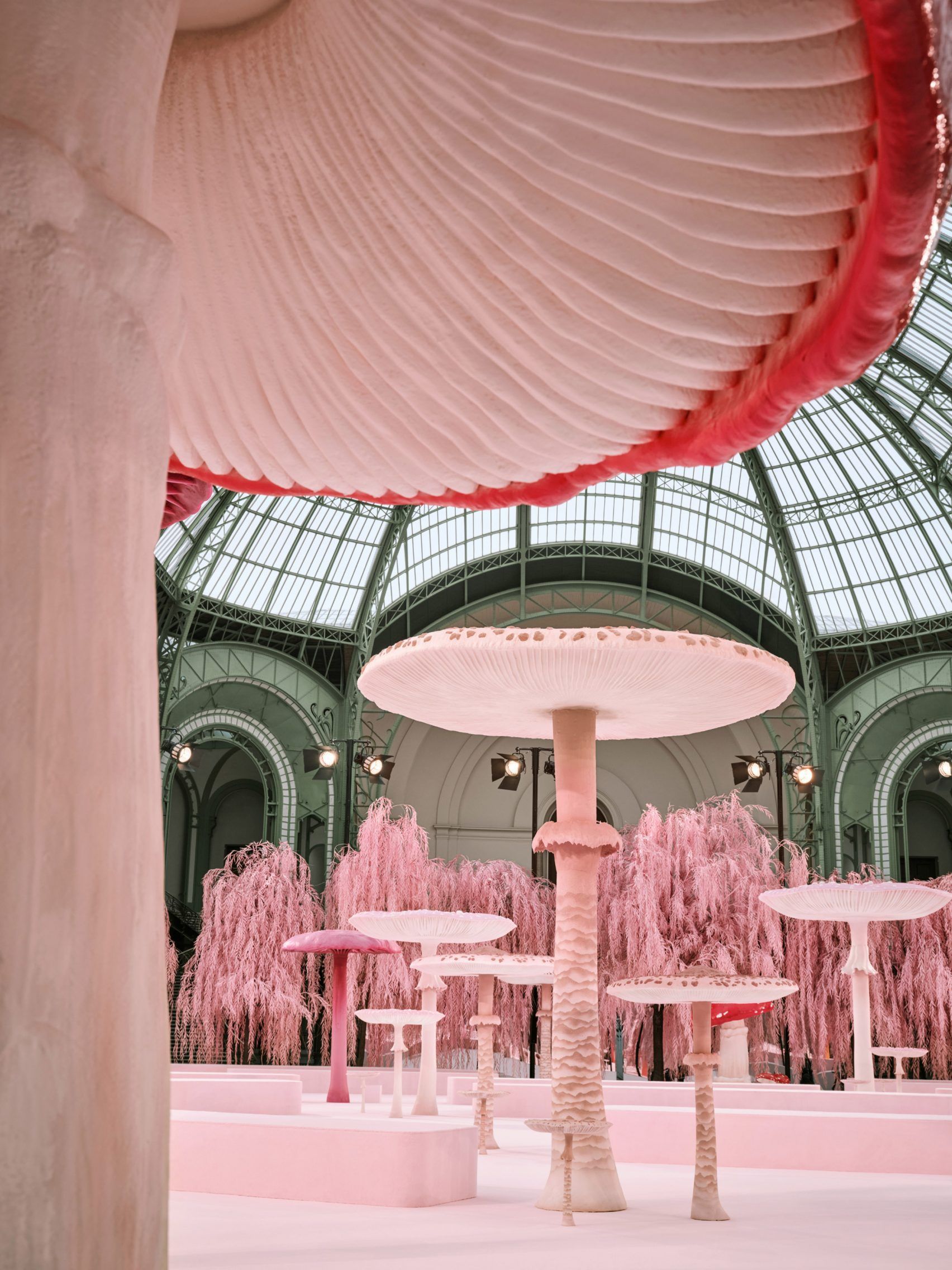
I think one of the biggest shifts we’ll continue to see is the transformation of the everyday through whimsy and narrative. Take Chanel’s towering mushrooms at the Grand Palais, and Lego’s multi-year collaboration with Crocs (shoes shaped like giant bricks), as examples. In an age where AI can generate almost anything instantly, storytelling and emotional resonance become the differentiators.
Locally, Gina Wilkinson’s work with resin and clay sweets, and the Daisy Street paintings by Skinny LaMinx, underscore this trend. For me, this points to a broader move towards design that re-enchants the ordinary.
2. Material as medium, not afterthought
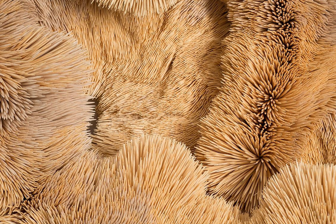
I think we’re going to see a much stronger emphasis on materiality – not as a finish or aesthetic choice, but as the core medium of meaning. I’m really interested in designers who are embracing roughness, texture, and unpredictability. In interiors, we’re already seeing rattan, bamboo, stone, linen, and handcrafted ceramics returning with force. That shift toward tactile materials speaks to a broader desire for authenticity and grounded living in a very digital, AI-saturated world.
Someone like Chris Soal is a great example of this. His use of toothpicks is incredibly intentional, and the material itself becomes part of the conceptual language of the work.
3. A return to inner worlds, intuition, and the surreal
Conceptually, I think we’re seeing a return to inner worlds – intuition, spirituality, and the unseen. The Investec Cape Town Art Fair has seen panel discussions exploring themes of inward listening and intuition in contemporary art, which feels very telling of the moment. Similarly, studio Viviers’s latest range, “SCARAB: I am a Spiral within, Eye within the spiral SS26,” gestures toward interiority, cycles, and self-reflection in a poetic way.
This is partly a reaction to AI. As generative systems become better at replicating style and surface, there’s a growing desire to foreground what feels irreducibly human – dreams, subconscious imagery, embodied intuition, and subjective experience. I expect we’ll see a renewed interest in surrealist aesthetics, speculative narratives, and symbolic visual languages.
4. A rebellion against millennial grey/beige
I also think we’re going to see a rebellion against the muted neutrals. After intense negative reactions to Pantone’s ‘cloud dancer white’ as colour of the year, I’m noticing a return to bold colour, colour-drenching, and high-saturation palettes. Monochromatic schemes in intense hues – acid greens, saturated reds, deep blues – are re-emerging across fashion, interiors, and visual communication.
It feels like a visual pushback against neutrality and algorithmic aesthetics. Bold colour becomes a way of signalling intention, authorship, and emotion in a landscape that’s increasingly flattened by templates and generative tools.
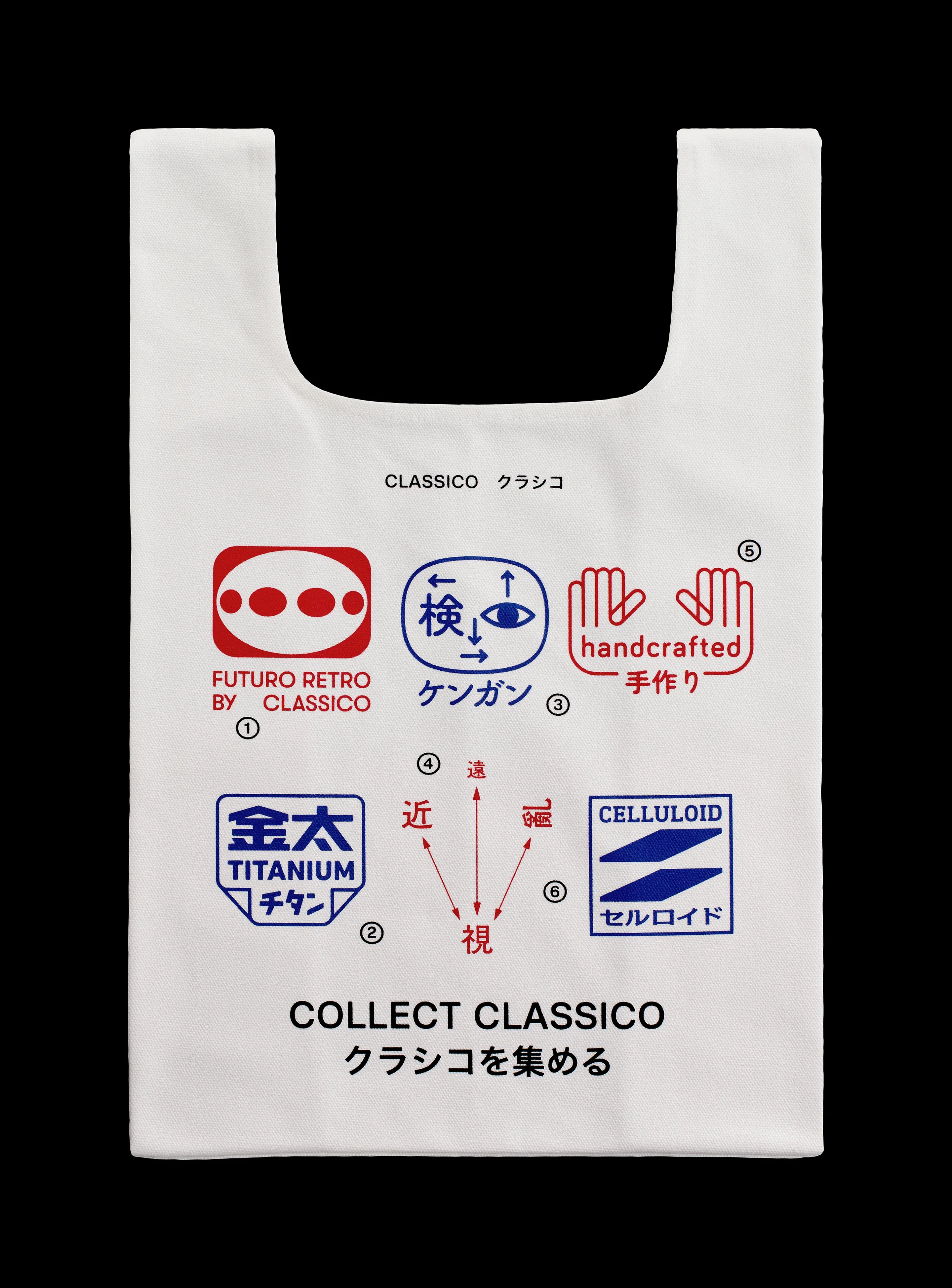
5. Nostalgia as emotional strategy
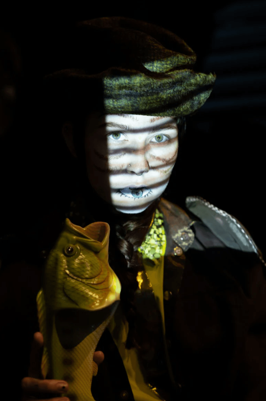
Day Night Company: M07 visuals behind the scenes (Copyright © Day Night Company, 2025)
I also think nostalgia is going to play a big role – whether that’s naïve, almost childlike illustrations that feel hand-drawn with crayons, or more explicit throwbacks to 90s and 2000s aesthetics. I’m noticing designers tapping into collective memory as a way to build emotional connection, especially in branding and campaigns.
In a world that feels increasingly synthetic and accelerated, nostalgic references create a sense of familiarity, comfort, and shared experience. It’s less about retro for retro’s sake, and more about using memory as a design tool to evoke feeling, identity, and belonging.